 EHR Risk
 Workbench hub · UI route /analytics
Analytics dashboard
Explore cohort distributions and model artifacts with charts, tables, or split view — plus age-band / label / patient filters.
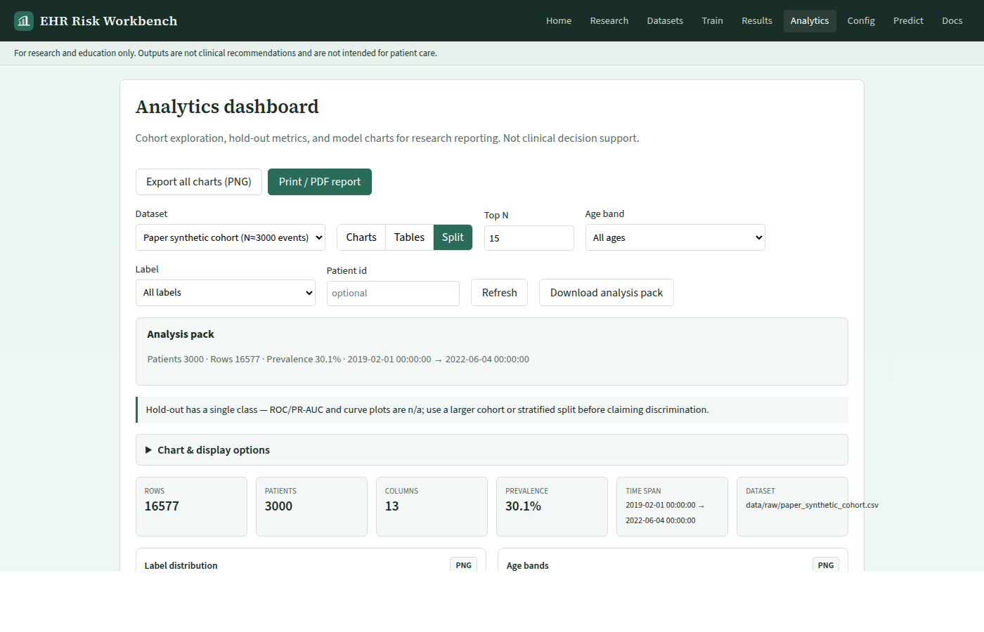
View modes
Charts · Tables · Split — persisted via Config UI preferences.
Charts
- Label distribution
- Age bands
- Sex distribution · label prevalence (toggle in preferences)
- Missingness
- Numeric preview
- Hold-out metrics
- Feature importance
- Model comparison
- ROC curve · Precision–Recall · Calibration (reliability) — from
evaluation_report.jsonafter retrain (GET /v1/reports/curves) - If ROC/PR are empty, Analytics shows an explicit empty-state (retrain / larger cohort). Tiny demo hold-outs are often single-class.
- Header Take tour opens a short page tour (spotlight + docs).
Toggle individual cards from preferences; canvases stay mounted so redraws stay reliable. Bootstrap AUC CIs appear as a quality note when the hold-out supports them.
Export: per-chart PNG buttons and Export all charts (PNG); Print / PDF report opens the browser print dialog for methods appendix figures (research use only).
Analysis pack
KPI strip (patients, rows, prevalence, time span) backed by GET /v1/reports/analysis-pack. Download JSON for supplementary tables.
Workflow: Trust surfaces · Research workflow (repo)
Filters
age_band·label·patient_idon profile + cohort table- API:
GET /v1/datasets/profile?path=&age_band=&label=&patient_id=